Developing & Designing my Website - Part 1
19 min read
Updated: 27/09/2022
September 10, 2022
Coding the frontend of this website took a very, very long time. There were so many things to learn, and challenges to overcome with novel solutions leading to over 7,000 lines of code on launch! In this series of posts, I will look at the gruelling process I went through, as well as examples to explain my solutions and thinking. Hopefully, you can take a little away from this and maybe even implement some of my code :D
The first part of this (frontend) series in a (launch) series focuses on setting the scene, looking at the process holistically, and discussing design.
What is 'Frontend'?
The frontend of a website is everything related to the user interface - the things that the user sees on screen and can click and interact with. For websites, the frontend always uses the same 3 programming languages at the heart of it - HyperText Mark-up Language (HTML), Cascading Style Sheets (CSS), and JavaScript (JS).
HTML is used to create the actual content seen on screen, CSS is used to make the content look nice, and JS is used to create interactivity.
Usually, especially in production settings, a modified version of the languages are used to make development easier. Developers typically use CSS pre-processors such as SASS or Stylus, which is almost like a frontend for CSS itself! There is a clearer or simpler syntax which makes the code cleaner and faster to write. Something like Bootstrap or Tailwind is also very popular, because it can make styling with CSS much easier (at the expense of beautiful code). Finally, there are JS frameworks like React (Meta) or Angular (Google) which simplify certain processes. There are frameworks and libraries for everything to do everything.
However, I didn't use any frameworks or libraries in my frontend (except one we'll get back to later) - I used the vanilla ('classic', or unmodified - think vanilla ice-cream) versions HTML, CSS, and JS. Why? Why would I subject myself to so much pain when, in reality, frameworks are used everywhere in production websites to make developing faster?
Well, for...
- Fun - there are arguably less internet resources for vanilla languages (since they are rarely used by themselves), so I have more to figure out myself! Doing it all from scratch is just more fun and feels like a challenging journey, with lots of pride at the end.
- Understanding - through using the base technologies to create my site, I force myself to truly understand the roots of the language and the web. I haven't just followed some commands in Bootstrap or React tutorials to reach the outcome. This ensures, but more importantly, proves to people and employers that I must have a very strong understanding of the 3 technologies. Practically, it also means that I can move between frameworks and libraries easily as I'm not comfortable in just one and nothing else - as I know the basics very well, I will be able to move between all the frameworks very fast. For example, if a candidate only codes in React for a Google job application, but I code in vanilla HTML/CSS/JS, then Google has more reason to believe that I can code in Angular better than the candidate who only uses React as the other candidate may struggle to learn Angular if he doesn't know the languages inside out. Even if I apply to a React job, the employer would know that I have a deep understanding, and it wouldn't take me long to grasp React so that would be a smaller factor.
- Power - ultimately, with the vanilla language, I have the most power I can get at my fingertips. Frameworks and libraries are all built on top of these bases, so they can't possibly do more than what I can [theoretically] do with the language. Having access to the latest features and syntax is much more powerful than just using someone else's code - what if you don't like a certain aspect of their design? You can either deal with it, or have to write the code from scratch anyway to get exactly what you want. I can [theoretically] turn anything in my mind into a real thing through vanilla languages. Granted, there are many areas where you can customise or modify the code you take from libraries, but that requires good understanding of the vanilla language to do so anyway, coming back to my previous point. And if you want everything to be just how you like it, the level of customisation required is so high that you barely save any time by using pre-built components (only applicable to libraries and not frameworks).
Something to note about frontend is "semantics". It's the idea of making sure all the code is used meaningfully. There's a whole thing about it, but it's largely intended for accessibility reasons, as well as being good practice in the industry. The main area to note is that you should use the most 'correct' HTML tag whenever possible. For example, if you link to another page and make a button for the UI, you may think you should use the <button> tag. But nope, it should be the <a> tag! There are loads of standard rules used to make semantic code, but they are well worth learning.
I wasn't very good at keeping my code semantic though – I just chucked almost everything in a <div>! However, when I begin to make sites that aren't just for me, I'll have to ensure all the code is semantic and accessible.
Progressive Enhancement
First off, I've seen it be called the "accessibility stack" somewhere in relation to accessibility, but the Wikipedia article from where I first saw this refers to it in context of progressive enhancement.
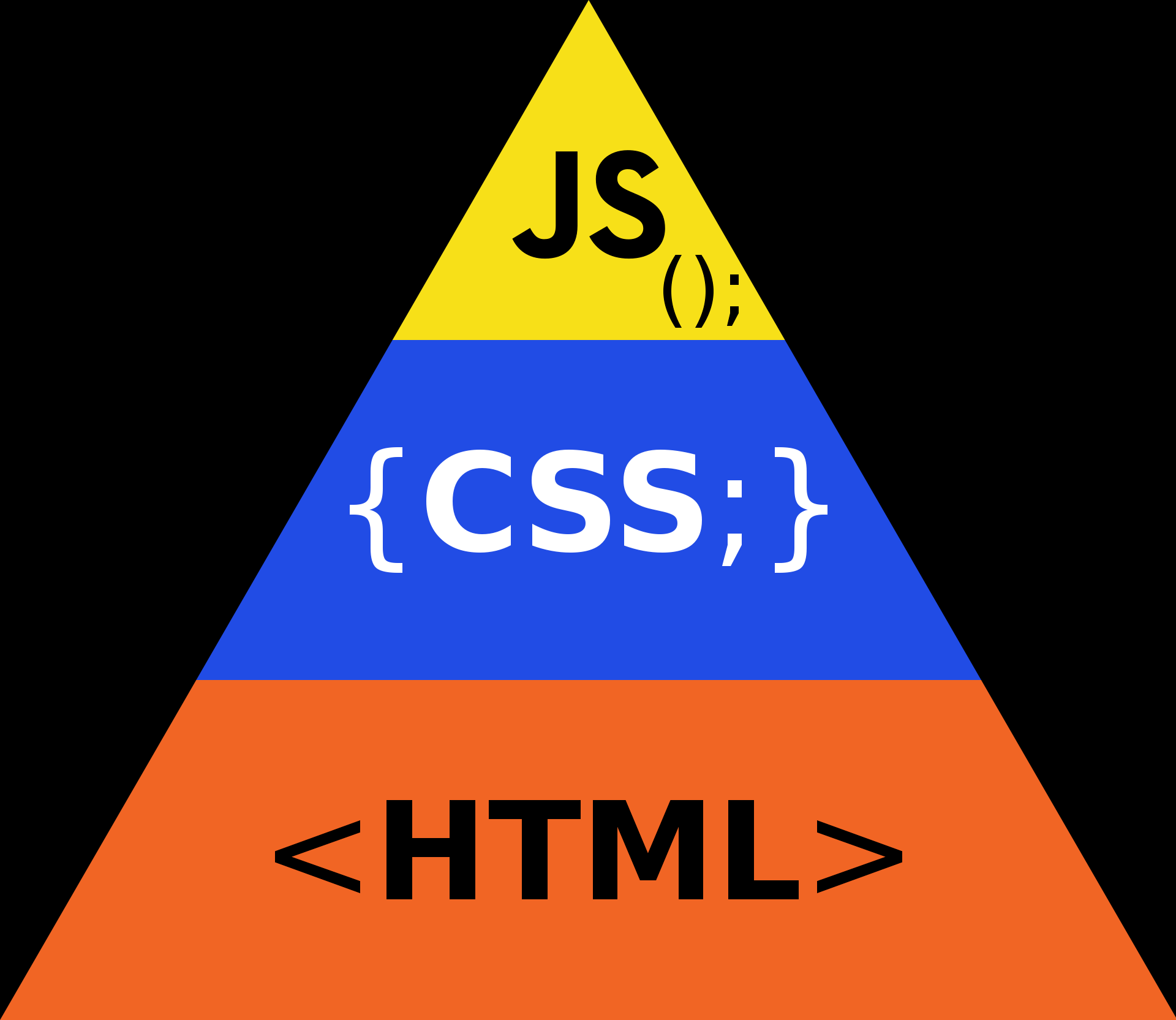
The progressive enhancement/accessibility pyramid model – the relative amounts of each language that should be included in a website based off support/robustness, decreasing as you go up
The idea is that, of the three primary frontend technologies, HTML is the most robust and will work pretty much everywhere, even if there are errors in the code and so on. Then CSS will work almost everywhere, again if there are errors in the code, that line of code is ignored but the rest still works. Finally, JS is the least robust. Lots of people turn off JS for security reasons, or browsers may not support it. If there's a runtime error in the JS file, then the entire JS file just stops working from that point in time, or if there's a syntax error... then the file is completely malfunctional.
So progressive enhancement is about taking into account the robustness of the code in question, and seeing how many of the users that visit your site will be able to see the feature in question. The purpose is to ensure that every user has at least the content on the page, even if it is ugly. Then, ideally every user should have good styling and therefore an overall good experience.
However, there are some things such as custom scroll bars or custom text-highlighting colours that may not work on every browser on every device. But these are what are called "progressive enhancements" - enhancements to the website that make it just that little bit better, but aren't necessary and not everyone visiting the website may even be able to see them.
These nice to haves are very important to keep in mind – you have to consider what most people will see, and what cool little features you can add that some people may not see. You have to ensure there is always a good UX, but where possible, you try to create an even better UX by going up this progressive enhancement pyramid, or adding niche lines of code that may be unsupported.
Lots of code in these frontend languages are only supported by select browsers, and caniuse.com is a great site for checking support. If not all the boxes are green, then whatever feature you're adding using that code has to be a progressive enhancement, or else you risk bad UX for a significant minority of users.
This was quite a major thing back in 2003, when it was first coined, but as support increases across all browsers, it plays a slightly less important role. Nevertheless, keeping as much functionality in HTML and CSS is ideal (I will admit, I haven't done this very well! At some point, I might make a no-JS site but for now, a warning will suffice).
The Development Process
I'll give an overview on how I coded the frontend of the website, from nothing to a place where it was ready to be put online. The process outline I undertook was like this:
- Think of what I want on my website
- Research for inspiration
- Design the page
- Program it
- Test it
- Bug fixes/enhancements
- Beta test
- Add content
When researching, I would search up loads of images on Google, visit impressive sites I came across and analyse them, and look at blogs or video that cover the "top 10 landing pages" for example. This was a very long process, and I found ideas spawning all the time and everywhere, from my bed to Pizza Express.
As I design, I would try to picture some things in my head, and would usually do some sketches and brain dumps on my Surface Pro. After this seemingly endless cycle of inspiration and drawing, I would finally land on a design that I was happy with and checked all the boxes. I'd have to consider a lot of factors in the design, because typically the web developer and designer are separate people, and the dev would get a full design schematic from the designer. The dev's job would be a clear implementation so he wouldn't have to think loads about small design details - especially as devs are usually bad at design!
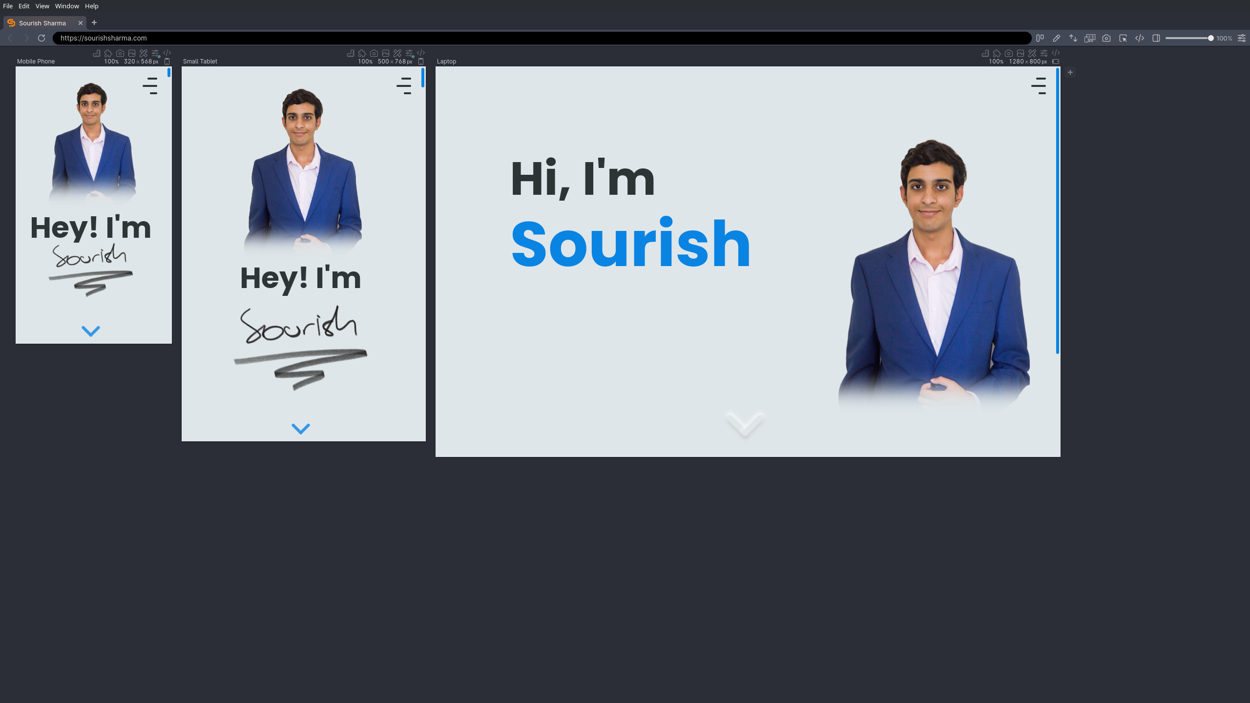
I designed the computer layouts first, and then the mobile, and I also coded this way. Coding this way is not recommended in general though! This is because a mobile layout is typically simpler than a computer one, so when you adjust the code for mobile screens, you have to overwrite and remove a lot of the code you just wrote for computers, resulting in a messier and larger codebase. You could also encounter issues with all of these pre-set values for computers that you don't want on mobile – I can't even say how many hours I lost because of this! Since it was my first website, I think I can forgive myself, but next time, I need to definitely change my approach...
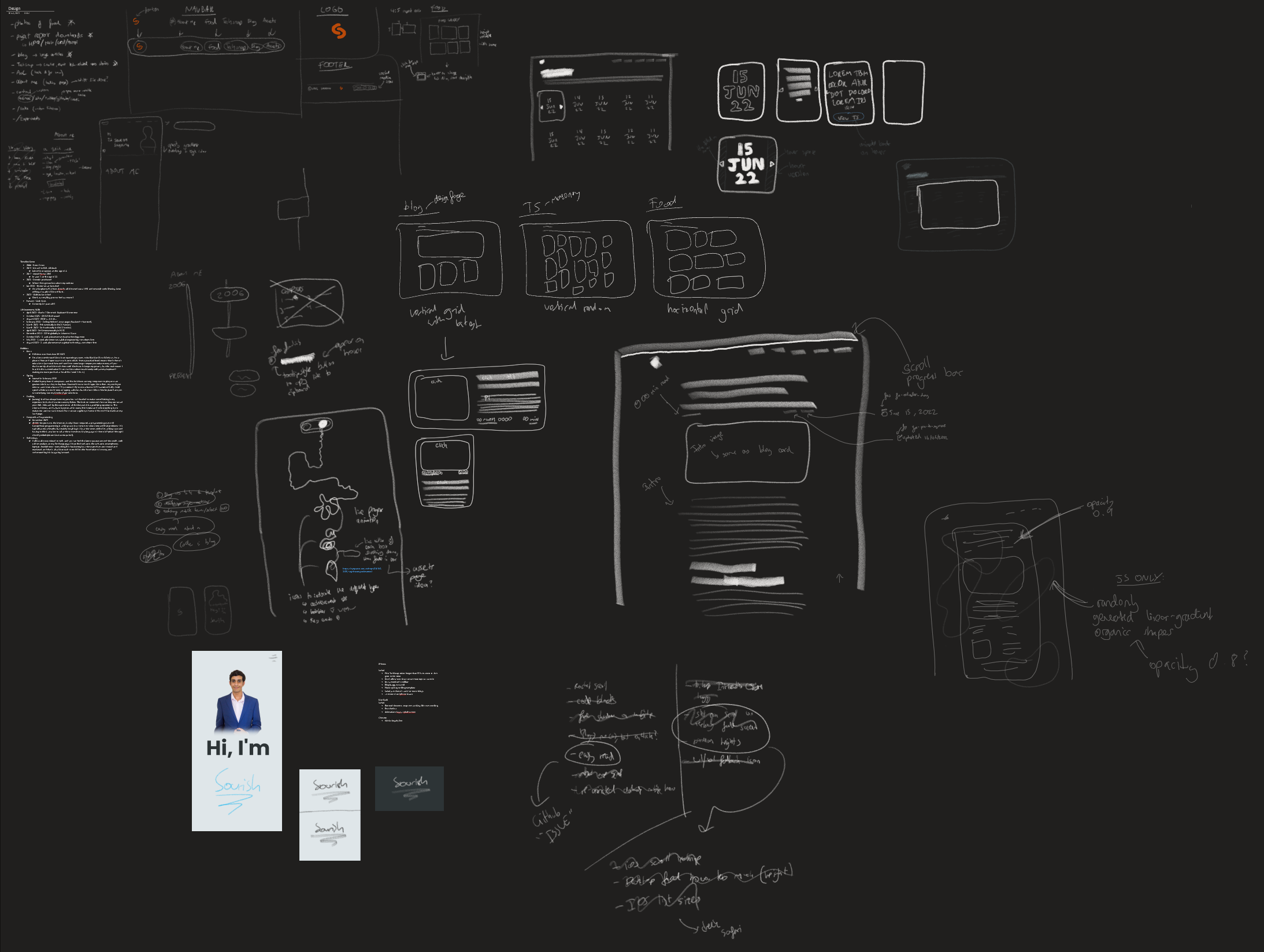
My design sketches OneNote page
You might be wondering why I didn't use Figma, a tool specially made for web design, and the answer is because I didn't need to. I wasn't going to learn more software for no reason. When I can visualise the design in my head, I don't need it - if I'm working alone on my website, there's no one I need to communicate the design with. Some rough OneNote sketches are enough to remind me of my vision and brainstorm.
That's not to say Figma is bad - in fact, it's an incredible tool! It's just not for me, and it wasn't an efficient use of my time for this project (yes, I dabbled in it).
I am a self-taught developer - I learned everything from random YouTube videos, questions in Discord communities, detailed blog posts, and most importantly, experimentation! The Mozilla Developer Network is definitely a huge win too. I feel like this self-taught approach is the best way to learn programming.
To get started learning how to code websites, I initially just followed a short video and wrote the code word for word for a simple website, searching up anything I didn't know (the video had no voiceover/explanations). This was really just to get in the gist of things and get more comfortable with the frontend languages. After this, I began with my own website.
Coding it would be a long stretch of writing HTML of one part, styling it, and repeating this until the page was done. Sometimes I'd have to write JS in between, but I mostly wrote it after the HTML and CSS. I'd be developing on my Linux system with the HTML, CSS, and JS files all open at once on a screen, my text editor of choice being vim (and I used Emmet, of course).
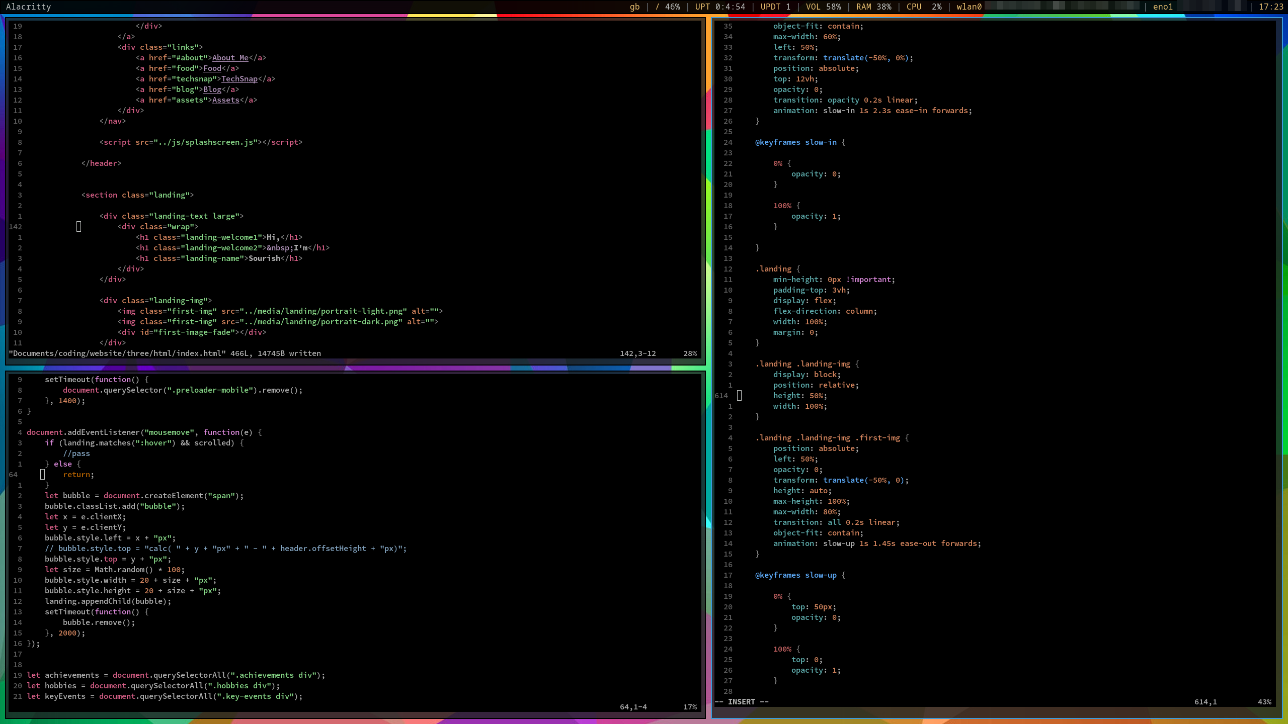
My coding workspace during development
I'd have a live server running for this directory (the npm package), and have Firefox in another workspace (the Linux equivalent to virtual desktops) which would be my primary browser for development - it has lots of nice tools to help me, as well as being my primary browser anyway! I'd also have Chrome up as it's the most common browser but works fundamentally different to Firefox, so I had to test in Chrome every now and then to ensure the styling worked (and fix it when it didn't).
A note about browsers - all browsers are based off a web engine, essentially the thing that converts code into a visual website. There are 3 primary web engines
- Gecko – used in Firefox
- Blink – used in Chromium (and therefore all browsers based off Chromium, such as Chrome and Edge)
- WebKit – used in Safari (and all iOS browsers – non-Safari iOS browsers are essentially just a skin on top of Safari as the web engine and way it works is identical)
So whilst I use exclusively Gecko, most people use Blink, but a lot of people also use WebKit. And all of these treat code differently. Argh. The screen size and device platform also affects how your code is displayed. This means I have to test as many browsers as I can across as many devices as I can to ensure the experience is just as good on each one – it doesn't have to be identical, but it still has to be good.
Designing for multiple screen sizes is called responsive design - as your website will respond to different sizes. Responsive design is quite hard, but there are lots of tricks and guides to help you, and articles with the most common screen sizes. However, the piece of advice I would give is that you should initially ignore common screen sizes, and just add breakpoints when your design begins to not work, such that you've 'fixed' the issue. Once you're done, then perhaps consider 2 or 3 of the most popular screen sizes and platforms that your demographic of visitors will use, and optimise the site for them to create the best experience for the majority of users. For example, I know a lot of my friends and people in school have Surface Pros, so I ensured my website works as perfectly as possible on these devices, especially the parallax which has a device dependent layout (and the user really needs to be immersed here for a good experience).
The testing would happen simultaneously (with coding) on Firefox, testing lots of different screen sizes and simulating phones. Only once I got the site live on the internet (a week before launch) would I test on real phones. At this point, I also got my good friend to do some beta testing and get 3rd party opinions.
During all this testing, I'd make short mental lists of things I had to fix, and then fix them. It was a long process, and there were always going to be endless bugs and improvements and enhancements, so I had to draw the line somewhere.
I needed the user to have an overall good experience and encounter as few issues as possible, but also not spend an extremely long time fixing everything; especially the most complex issues or the issues that a very small proportion of people will see. I had already spent a while making the site, but I think that in the end, I did strike a good balance of bug fixes and pushed the site out in good time.
Back to the point about browsers - whilst Firefox is overall the best 'conventional' browser for web development as it makes debugging much easier, there is a better browser. Chrome has a couple of things that Firefox doesn't, such as much better mobile device emulation (and the popularity idea), but there's still a better browser.
It's designed for web devs, and it has absolutely everything a developer could dream of. And more. Now, looking at it, it may not seem as good as it is, and looking at all the marketing and videos people have made of it, I sure wasn't that impressed. I thought it was an overdone, excessively hyped browser. But dear oh dear was I wrong.
Now, I haven't used it much, but after spending straight weeks developing on Firefox (and Chrome), it was so refreshing to dive into Polypane. Normally, it feels like you're battling against the browser to do whatever you need to do, but with Polypane, there are so many nice things that make the process of web development much more seamless - every now and then, I'd ignore an issue or not test it on Firefox just because that's too much effort. Not on Polypane. Maybe I'll write another blog on Polypane later.
And the reason I didn't initially use it? Because it's expensive and I wasn't going to pay that much just to help develop my site (especially if I make no money from it). However, it was a gem to find that I get a year for free of Polypane from GitHub Education! Irritatingly, I found this deal the day after launch, but nevertheless, I'm ecstatic to use it moving forward.
Loading up Polypane for the first time and visiting my website
In terms of post-launch work - there's a lot of content writing! I'm still getting into the swing of things and learning, so I'm bound to become more efficient. Also, there are some enhancements that I can always make to the website, so those will slowly be rolled out over time – the GitHub page is where I track these.
Once I have a few blogs out, I'll work on the Assets page and focus on redoing the About Me section - maybe a weekend hackathon!
General Design Themes
I'll talk about design all at once and then the coding separately, just in case anyone here wants to read about one but not the other.
First off, UI and UX.
- UI - User Interface, the things that the user interacts with and sees.
- UX - User Experience, the experience that is curated for the user, and the overall holistic impact of something inflicted on the user emotionally.
Both terms are commonly used in context of design, though sometimes UI can be used to refer to any element on screen, such as a button.
The design was the first stage for everything I did - before I can code something, I need a clear design in my head. But before I could even think about creating my website, I needed to think about the rough idea and vibe I wanted. The vibe was easy - something that's professional but still lets my personality shine in a more playful, fun manner. I think I achieved that in the end?
The design... I wanted something unique that would stand out, and whilst accessibility may be a concern in the future, for a personal website that doesn't have a large audience and is not selling a product, I decided that a very accessible design with high contrast UI elements is not crucial. I wanted something that looked refreshing but familiar, something that could easily accommodate both light and dark modes (I love dark mode too much – there's even an Easter egg AMOLED dark mode toggle hidden on the site), and something that would challenge my creativity and design skills.
The quest for a nice design was hard, and after a lot of looking around at websites for inspiration, I quite liked glassmorphism - a modern, elegant look with lots of blur and abstract designs and, well, glass. The latest Windows and MacOS versions seem to lean a bit heavier into this style.
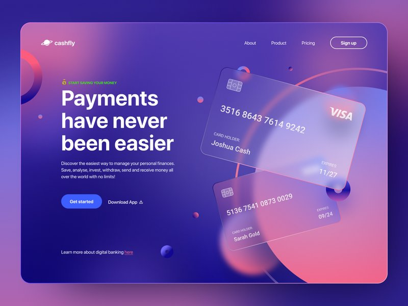
The Glassmorphism design trend – abstract colourful shapes, transparency, and blur
However, I saw some issues - creating a simple dark mode toggle would not be easy as a lot of colours and things would have to be changed. Also, it hinges on the fact that there is a background of some sort. Abstract colours, illustrations, or anything. But this would also be challenging to implement all over the site, finding these backgrounds and making them work. Glassmorphism also seems a little space inefficient for this reason that it has to emphasise the context. Finally, I thought that maintaining a consistent but practical and free aesthetic across the site would be hard. I just didn't think I would be able to pull it off consistently right.
So I settled on the neumorphism design trend.
It's like skeumorphism, but 'newer', hence 'neumorphism'. It takes the old feeling designs like the original Apple iOS icons, and blends them with the newer, cleaner, flatter icons and shapes to still maintain a 3D effect, but does so in a more minimalist way. I loved it. A lot.
This idea of minimalist 3D is a new trend in MacOS's icons, and a similar idea in the Google Workspace rebrand a few years ago where the flat colours stack on each other with transparency.
I don't know what about it, maybe it's the softness (neumorphism is sometimes referred to as "Soft UI") or maybe the clean minimalism that still maintains a level of complexity that can be appreciated. Either way, I knew this had to be what I wanted, and it looked simple enough to execute...
But there were very few websites that used this design style – it was more common in mobile apps with a touch UI, but that's not too useful if I'm designing a website. The lack of resources and inspiration for neumorphism made the design stages very difficult. I had both come up with original ideas, but also bring together current designs and morph them into something neumorphic.

Neumorphism is used here and there, but some good examples for my fellow tech geeks are the MKBHD logo intro animation (left) and the Samsung Unpacked event branding for 2020 (right).
Neumorphism creates a 3D effect by making most elements the same colour, and then adding a box shadow to them. When done consistently, it looks like a light source comes from one corner of the screen, and onto a smooth 3D object sticking out (or in) from the background. It's weird, but the shadows manage to create the required distinction between elements - and all with just one background colour! I chose the light source to be in the top left because it felt the most natural.
Then, I had to choose a secondary colour - a colour that could be used to complement the primary and add more life to the website. A lighter green or blue seemed apt, and since blue is the world's favourite colour (and no one likes the same shade of green as each other anyway), I went with blue. Finally, I chose the text colour. It obviously had to have a lot of contrast, and so black it was! But what many people don't realise, is that black #000000 on white #FFFFFF is not good. Waaay too much contrast that just makes it unpleasant and difficult to read, causing eyestrain. As I went with a slightly off-white, I also went with an off-black to create a nice, soft text colour working with the soft UI.
These 3 colours were all that I planned to use, and just inverting the black and white for dark mode. A really simple, consistent colour scheme is powerful. It maintains an identity and creates a minimalist-looking site. All 3 colours have a clear purpose, and don't confuse the user, and I can use blue for animations as an accent colour, or to gain the user's attention as less-commonly used colour.
My colour scheme was inspired by this random Codepen I found – I struggled to find colour palettes for neumorphism, but the American Palette here seemed nice.
Another detail about neumorphism is how it doesn't really work with images (as there are so many colours, and it's flat) - but it very much works with icons. My website wasn't going to have many images (except in posts) so this is ideal. Icons can also be integrated everywhere, so I loved how I could use them loads and still ensure the design looks nice - as icons are minimal and fit the colour scheme. When it comes to images, though, I would have to round all the edges to maintain the soft feel.
I just love icons – probably because I love emojis - if you couldn't tell already!
Finally, the font choice was a nice, friendly font that was still clear to read. I really like it, Poppins, and find it complements the theme very well as it feels soft and light, but maintains professionalism.
Conclusion
Now you have all the fundamentals of web development nailed! We've had a look at how I went about creating this site, as well as the major design decisions along with my reasoning. Hopefully you learned something, and in the next part we'll look at some more detailed and specific design phases. I hope I explained everything in a fun but informative way!
If you want to read more about neumorphism, this is a great article. Or if you just want to mess around with the idea, I love this site!
copied!
failed to copy!