Developing & Designing my Website - Part 2
43 min read
October 2, 2022
This is the second part of this series in a series, looking at all the specific design areas across the website (as of writing). This will be a long one, but as with all my blogs, you can always copy the link to the section (by clicking the chain icon next to each subheading) and save it for later to finish reading when you come back! Or you can just read the sections that interest you - this post has been curated to allow for 'modular reading'. Here, I'll discuss the full design process, methodology, and mindset for each component of my site.
After reading this, you'll never be able to look at websites the same way again - your mind will be analysing the design and layout of every site, and you'll realise that you notice things you'd never see before!
Logo
Let's start off with the most important aspect – the logo! Now, I will admit, I spent very little time on the logo, but ended up with something quite nice and relatively unique. I wanted a personal logo that I could use throughout the site in all the typical places, but also something that I could plaster wherever I want to in the future. It had to encapsulate some key things about me, but be very simple and even abstract.
I was quite into logo design a couple of years ago, so I still remember a lot of the key concepts of it - in reality, it's more of a science than an art.
I did some quick sketches and brain storms, establishing that I should include an 'S' in my design since my initials are 'SS' and I do kind of identify myself through 'S' a lot - it is a key part of who I am. I soon stumbled upon an idea with two curved lines to create an S.
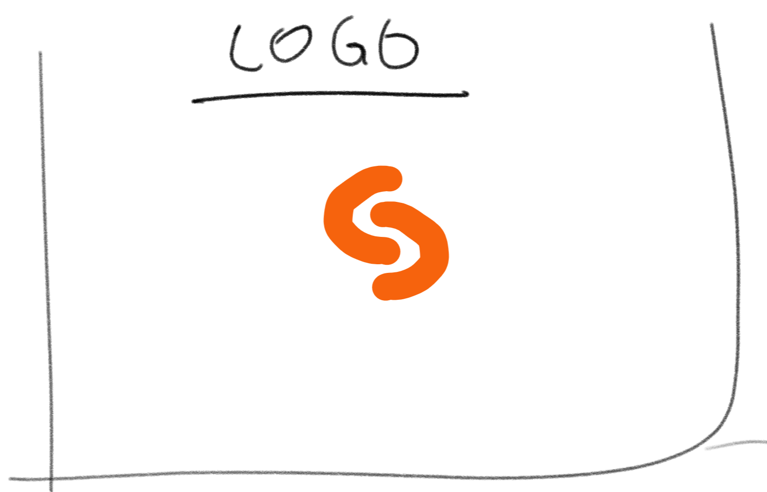
The brainstorming sketches for my logo on my OneNote page are quite... Minimal.
A very - and I do mean very - quick sketch in GIMP got me a rushed-looking icon that I could at least use whilst coding the site as a placeholder for the real logo. In fact, it's still the favicon (the small icon you see on the tab in a browser) of the website! It was low res (perfect for a favicon and quick load times since the browser never renders them above 32px anyway) and imprecise, and although it doesn't look as nice of a favicon as the refined logo, I quite like the rough sketch aesthetic; not everything about my site has to be professional and uniform. A more chilled favicon gave better vibes.
But before launch, I had to make the logo properly, in a high resolution and precise way to make it look nice. So I was lazy and loaded up Canva (my preferred software being Affinity Designer). Soon enough, I created the logo and chose a nice orange I liked. This time, the image was 500x500 pixels (perhaps a little overkill), and both elements of the logo were the same copied piece for perfect symmetry.
However, if you look closely, the spacing is not perfect as I did that part by eye! (so don't look closely)
The end result is a logo I really like. It works in greyscale just as well (important when I have limited colour selection), but the orange also represents my favourite colour (which I really just wanted to include all over the website in some form) and happens to fit the colour scheme quite well. The orange parts seem to come together to form an S, but the negative space (negative space is powerful) between them also creates a second S, almost spelling out my initials. The double 'S' is also conveyed through the double orange part. The logo is clear and easily recognisable both at tiny and massive sizes, which is essential for it to be used anywhere.
The logo fits in a square perfectly, which is ideal for symmetrical layout and other uses. It feels distinct, intentional, and firm - great to suggest the professionalism, precision, and perfection that I always strive for. Overall, it just works!
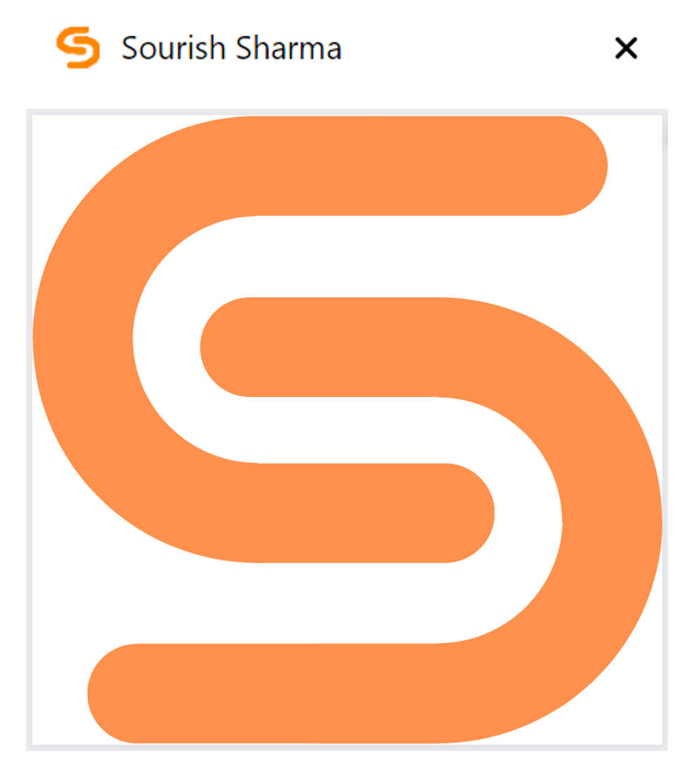
Chrome Tab at the top, showing the favicon. Final logo design under.
Splash Screen (computer)
The splash screen is meant to be the introduction to a website, shown before the user reaches the home page. Splash screens aren't too common in websites, but when you do see them, they are typically things like asking the user if they want to change to their national version of a website (i.e. amazon.co.uk instead of amazon.com). Mobile apps also kind of have splash screens, but most of the time, it's just the logo and maybe the name of a company coupled with an animation.
I wanted a splash screen introduction animation on the home page of my website - it would serve to show off some of my coding skills and maybe also something about me to first time visitors. Hopefully, it would get them excited to explore my site.
I originally pictured a really cool, really long animation with all sorts of hackery but eventually realised that no one wants to be waiting that long to get to the actual website; even if it's their first time. So I made it 1.8 seconds (+ loading time). I wanted to convey something about my interest in hacking and technology, so a matrix-style animation seemed perfect! I also wanted some sort of initial welcome message, so after looking around for a quirky, techy font, I implemented it through "fast typography".
The idea is that the words pop on screen rapidly, one at a time. To make it a little less harsh, I added a subtle in/out animation for each word (check it out now), and also a really quick emoticon at the end for character. These helped the animation feel even more energised and fast-paced whilst maintaining fluidity.
A really nice example of fast typography being used commercially is an ad from Apple, here.
Finally, I added some retro glitch effects as the animation ended. The green matrix 'rain' characters wouldn't actually touch the bottom of the screen, but instead stop just before. By adding the glitch effect, it accentuated the idea that something broke and really glitched, and that's what prevented the raining code from reaching the bottom. Hopefully, I made it feel like something went wrong and the animation abruptly ended, revealing the home page.
The 'Loading...' text right at the start whilst the page loads also differs from the other pages, to maintain the hacking terminal vibe. Imagine if I used the loading screens from the other pages here - the screen would be all white and then flash to a black/green matrix, which would be too startling (hurting my eyes) and eliminate continuity.
My original plan was to create a Linux terminal inspired loading screen, and straight up copy the output from my computer's log files when it boots, making visiting my website feel like turning on a Linux computer (which feels very elite for those that haven't tried). This would look super cool and realistic, but no one would recognise the easter egg and I already had a sort of cursor typing effect on the home page (an effect that I don't want to overuse).
Overall, I quite like the end result, and whilst I didn't end up implementing some fancy face scanning and malware animations, the splashscreen is concise and conveys the right vibe. Success!
Splash Screen (mobile)
Here, I wanted something a bit simpler, cleaner, and with less movement. More complexity and animations on mobile screens doesn't work very well in my opinion, but I can't pin why. I also needed something that could be a high resolution, as smartphones have pretty good displays these days and people tend to use them very close to their eyes!
Since it was for a smartphone, I used a similar idea to mobile app splash screens by basing it on my logo. This makes it feel more familiar and comfortable for a mobile user. There is no loading animation, just some simple loading text so the user knows to wait (or else they may just leave), but once the page has fully loaded, then the splash screen really begins.
Well, I'm not sure how one should name something like this. I believe the static screen with my logo and text is the splashscreen, but the animations that follow suite are part of the home page. Oh well, you get the point!
The overall idea with this splash screen and intro is to have a quick series of overlapping animations and make everything feel intentional to keep the user engaged. So each animation leads on to the next, and the user follows the animations as they happen in order.
Near the start, I have the corners come into the centre of the display so I can use the entire display and invite the user almost into the website, focusing their eyes on my logo. Then I animate the logo as I need it to disappear somehow, and making it come to life as it exits seemed to be best. Finally, I zoom the user into the home screen - which is just a blank canvas.
The series of fades and rises then begins, as the user's eye is softly but quickly drawn from the top to the bottom of the screen, encouraging them to scroll down. There isn't too much content, and it's all centrally aligned. Overall, this animation is quick, elegant, simple, and enticing - perfect attributes for a mobile splash screen. It's action-packed and exciting, with a central focus on my logo and me as a person.
Preloader
Content on a webpage takes time to arrive - your browser has to make lots of requests to get all of the things it needs to display the page. And if your internet is slow, then it may take a while for all the data (especially images) to be sent to your computer.
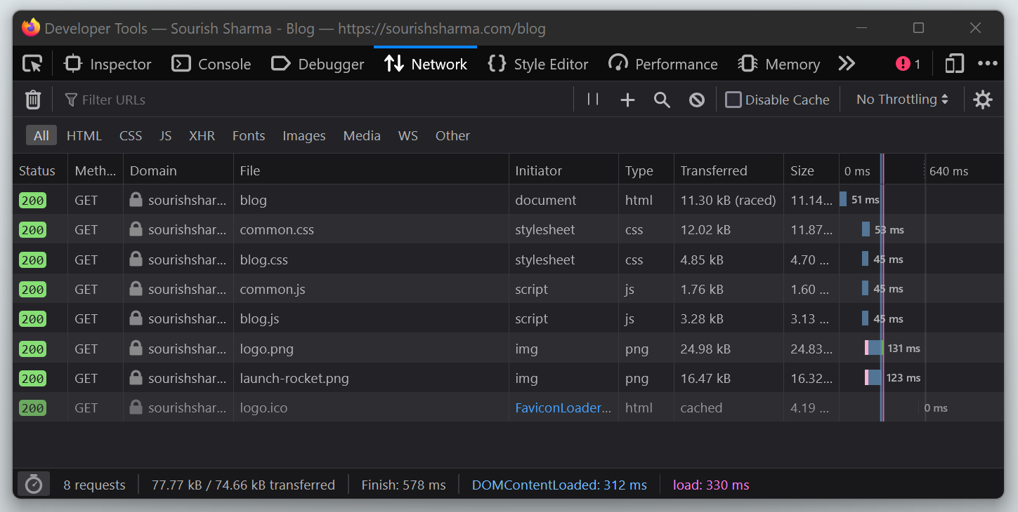
These are all the network requests which are being made just for the blog page with only one blog card. Check out the food page if you want to see a much larger list of requests - and you'll probably see the preloader too!
If a lot of the content loads such as text and icons, but the images have not finished arriving, then the layout gets quirky and the user experience is compromised. To solve this issue, most websites have a preloader which is a simple loading screen shown until the web page is all ready to be displayed. The preloader code has to be small, because if there is a large image, for example, then the browser will take a while to even load in the preloader, let alone the web page.
Some devs implement "lazy loading" too - only requesting the image when the user scrolls down far enough for it to matter, far enough for them to see it. On the other hand, "eager loading" loads in resources as they are called in the code (so right at the start of page load). It's slower (you see the preloader for longer), but ensures the layout works perfectly - independent of internet speed. I chose the latter trade-off. There's a whole thing about web page performance optimisation, which I'll leave for another time!
As for the design of the preloader, most websites would opt for a simple spinning circle, but some have fancy preloaders with all sorts of animations.
I went for something in between - I wanted to maintain the site aesthetic because the preloader is the first impression someone has of a page. I wanted it to be simple and subtle, but also pleasing to look at - in the off chance someone has to wait more than a few seconds for the page, at least they can get a little amused looking at the preloader; their eyes carefully tracking the circle round and around... What? Have you never endlessly stared at a preloader, hypnotised in awe as your slow internet painfully loads the content?
So I went with 3 circles with the box shadow around each one moving - instead of the circle spinning, I spin the box shadow. This plays on the design style of the site as it uses box shadows to create a spinning effect as opposed to a 3D effect. Or I guess you can say that the light source acting upon the circles spins around clockwise... Anyway, I thought it was minimalist, effective, clear in intention, and amusing. Awesome!
Oh, and on a side note, lots of things are abstracted and almost standardised on the internet these days, so ensuring to pick a design that is intuitive at a glance is crucial for good UX. A few examples are:
- Clicking the logo in the navbar to navigate home
- A spinning circle indicating a loader
- Underlined text representing a link
- A moon symbol indicating dark mode
Thinking about how our brains actually correlate these ideas with abstract elements is weird, but I guess that's how we are brought up in society. And any good designer knows to exploit this fact!
A perfect navbar is intuitive, simple, compact, functional, and almost invisible. Not much to say here, I just hope I achieved that! It's a simple navbar that has all the primary pages, and a nice hover animation that makes it feel as if you've turned the button into a 3D element (neumorphism!), with an accent colour for good measure, making it feel like you've just synthesised the button from the background. Many websites have a navbar that stands out from the page, typically by using a different colour, but this isn't seamless and clean so I didn't do that.
And, of course, I plastered another logo on it!
I've got a sticky navbar for the home page only, as it's quite a long scroll and I want to encourage the user to visit other areas of the site too, because typically only first-time visitors will see the landing page (the page that users would usually 'land' on, or first see when arriving at your site). The idea is to keep reminding the new user to do something, and a sticky navbar with bold buttons is the perfect way! A page such as a blog post has no need for a sticky navbar (we'll come back to this later).
For mobile, there isn't enough space to have a whole navbar visible, so a clean, square hamburger menu was ideal. Of course, I still had to add some flare through animations (try it; click the hamburger)! It's a subtle and satisfying transition, with a bit of speedy action for fun.
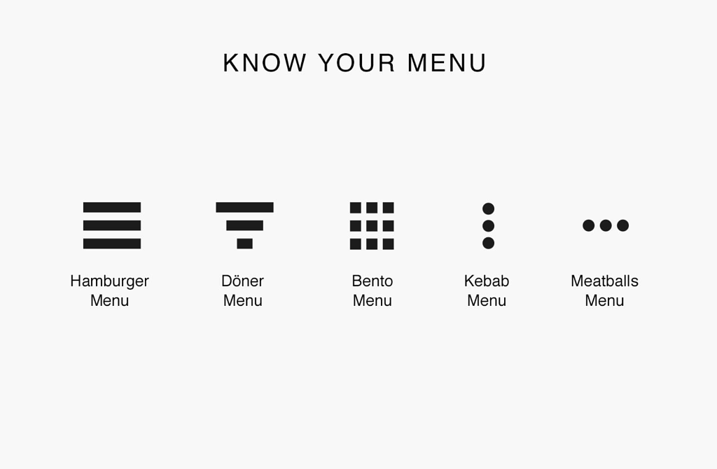
The most common menu icon types - some can get pretty crazy though!
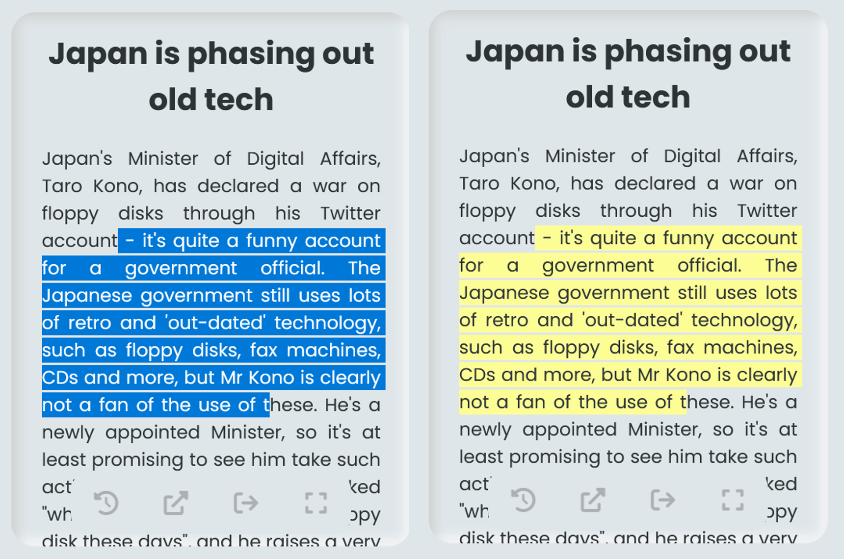
The mobile navbar menu itself is simple, and allows hints of the page content to come through to prevent it looking too bland, and prevent the user from feeling lost. As it's not obvious that the logo is clickable (no hover effect), I added a separate button for the Home page. This menu is also where the dark mode toggle lies, as it takes up too much space on a small screen otherwise, and the user doesn't need to toggle it often anyway. Also, the button would overlap with a lot of content as there is not enough spacing on mobile and this means the shadow creates a really undesirable glowing halo effect, which is not the intended 3D result.
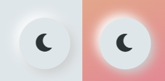
Normal background on the left, with the 3D effect. Coloured background on the right, with a weird halo effect.
Something that I wanted to point out, not directly related to the navbar but still important, is scroll padding. When you have an automatic scroll to a certain point on a page (such as the About me button on the navbar, or the link to subheading blog post feature), then almost every website will implement this poorly in code. The result is that it tends to scroll a little too far; perhaps not leaving any spacing above the scroll point, or all-together just covering the scroll point with a sticky navbar. This really sucks. It's both frustrating and doesn't bode well for the UX, so I ensured that would never be an issue on my site by adding some scroll padding to every automatic scroll - especially the blog ones. It makes a world of difference when it comes to usability, and shows which websites really care about the details. I guess I'm one of them :)
The footer had to be simple - not like all these other websites with footers that end up being as tall as the screen and have endless links. I didn't want to link to every page through the footer, or even link to a sitemap. I believe that the footer should just contain information which everyone expects to be there - information that doesn't really fit anywhere else on the site, but is crucial to have on every page anyway.
A dumbly sized footer, taking up my entire screen, clearly designed with the intention of getting more customers.
So I included my copyright declarative as well as contact social media links. Oh, and I've got to chuck the logo in the centre because it looks professional, and adds a splash of orange! The media icons are quite minimal until you hover on them, so it provides nice user feedback, opposing the navbar as these links are 'pushed' into the web page, whilst the navbar links are 'pulled' from it. Try it yourself and you'll get me. More importantly, however, the colours they turn into upon hover are the hex codes for the brand in question, or in the case of email, it's the classic red of the British post box.
The faint line above the footer helps space things out more and it adds a clear visual distinction. Space is vital - lots of empty space around elements makes the site feel lighter and easier to use, adding to the UX. So much of my time was spent trying to perfect spacing, as it really makes an insane difference.
An overwhelmed user will not be a user for long.
Since all the footer's information is critical, I would still need to accommodate it all on small screens that can't support the full width of the content. So I just put them vertically, like a pyramid to make it look pleasing. Everything is pleasing when physics is applied :)
Pro tip! I also added box shadows by default to the socials to make the touch points clearer. It's hard for mobile users to know if something is clickable (because they can't get hover feedback), so you have to make it really obvious.
Home Page
This is the first page that people see, so it has to be striking. It must convey everything I need - the clean design, my personality, who I am, and my web dev capabilities. The astute of you would notice that the home page is the only page which takes up all of the available screen width, in an attempt to make it more immersive (as opposed to practical).
The top bit of the home page - the part which the user first sees - is called the "hero" section. Don't ask me why, but it just is! I actually only learned this after I finished coding it, so all my code generally refers to it as the "landing" section instead. The hero typically occupies the full screen (height and width) and you've probably noticed that many have a similar layout - with a visual cue primarily on the right, and some basic text on the left. There's reason to this madness though.
Our eyes are naturally drawn to certain parts of the page, and so the hero design has to be quite specific to work well. It's where you'd establish the user experience and connect with the user. In fact, many sites use software to track user interactions on their website and build up a heatmap of user actions such as where their mouse moves, or what they click. This helps them understand what the users are attracted to, and where their eyes go, allowing the designers to optimise the website and almost control the user subconsciously!
Every aspect of design has to be thought about in detail, done with intention to achieve a clear goal. Especially the hero; the most important part of any site. No question.
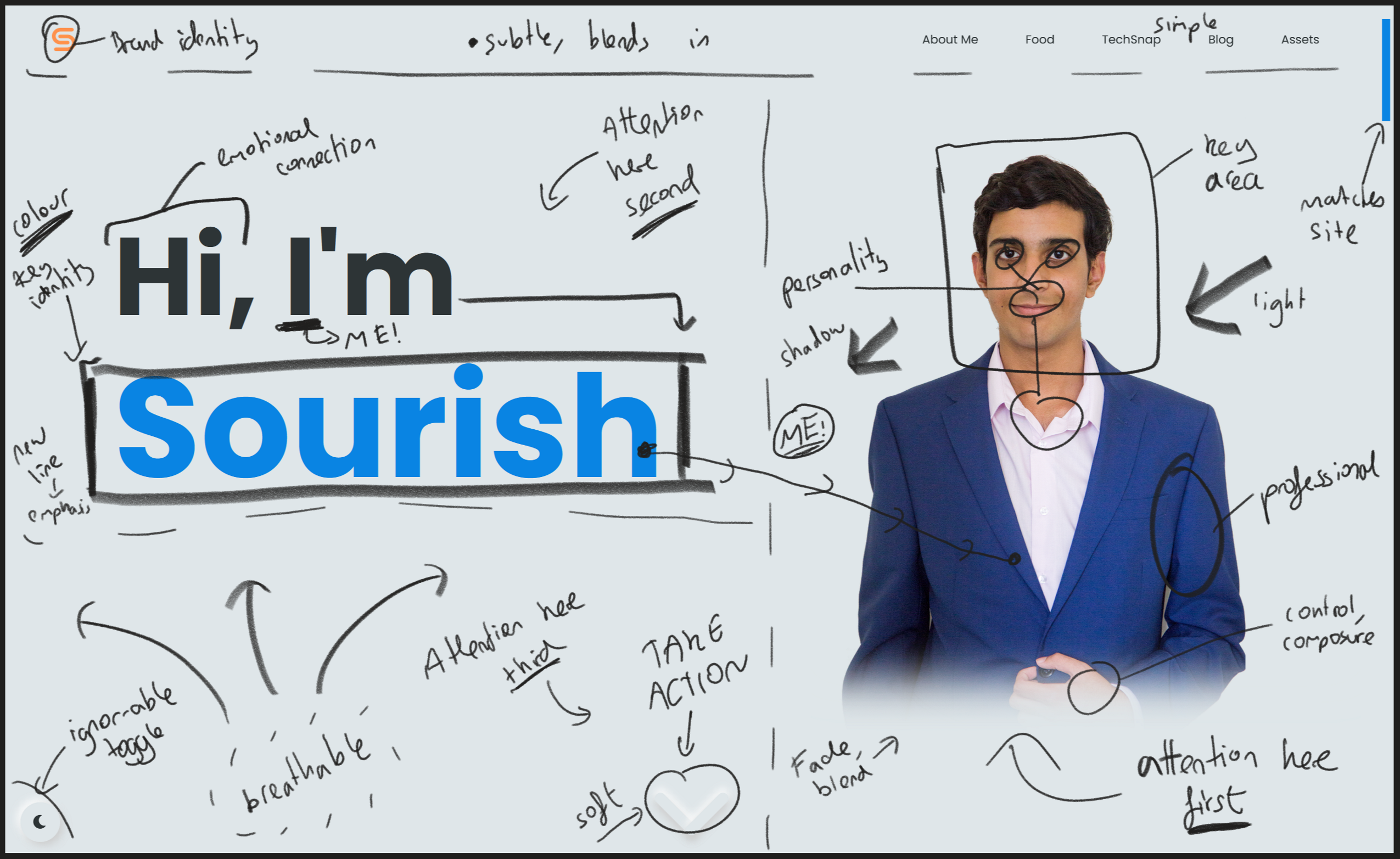
I wanted a professional photo of myself so people can relate to me personally more when they visit the site, and so I don't seem like a soulless figure behind the browser. The photo had to make me look serious, but have a hint of playfulness. It also had to work with the colour scheme and be clear on both light and dark mode. It just had to feel like it was part of the design, and not some random image overlaid onto it. So, I stood in front of the mirror for too long, posing in my pyjamas until I found something good. The pose was serious, but also a tad friendly, and not aggressive. Perfect.
The image background had to be cropped out to make the colours work, and make it feel integrated into the page. So the lighting also had to be good and even (but still with a nice shadow on one side) because without a background, lighting can look... wrong. Since I can't change my skin colour (well, I shouldn't) to fit the colour scheme, I chose a bright blue jacket as that's the accent colour, as well as a pastel pink shirt for a bit of contrast. A few minor things such as lighting to make the jacket look velvety, and my left arm sticking out to fill the space made the photo even better. The bottom fade was crucial to make the image feel part of the site (as well as hide the less important part of my body), much better than a sharp edge to the photo. Sharp edged photos with corners look ugly. When was the last time you saw one on a hero section?
An issue when cropping around me is that there is a very slight white halo - not noticeable in light mode. But in dark mode, it's very obvious. So a subtle black brush outline had to be painted around me to compensate and blend me in.
I also needed a welcome message, so a simple "I'm Sourish" is good. Even though the visitor already knows my name from the domain name, it adds another touch of personality and helps connect with the user. And just a "Hi" to almost initiate a positive conversation for the same reasons. It carries the clear intention of introducing myself to the user.
I animated this with a typewriter/cli effect to convey my love for computers and programming, but also make it a slow reveal so the user isn't overwhelmed with stuff when they first visit the site. It also almost feels as if I'm typing it myself directly to the user! I think it's quite a cool, impressive animation.
You may have noticed that the cursor on the effect doesn't jump along a character each time a letter is revealed, like a proper terminal cursor would. To achieve the effect perfectly, I would have needed to use a monospace font like Consolas, but none of them fit the site aesthetic well enough, and so I almost 'softened' the console typewriter effect by making the cursor rounded and using a rounded font. However, the blinking of the cursor maintained the retro feel I was looking for - although I softened this a little too.
So after looking through hundreds of other portfolio heroes, I was quite happy with mine. However, I realised it's not too obvious that you can scroll down as all the page content seemed to fit perfectly in the viewport, and it was a little bland once the typewriter animation was done anyway. So I needed a cue for the user to do something, or a Call To Action (CTA) as it would be called in more transactional websites.
A subtle arrow is what I settled with. It blends in enough to not be messy or distracting, but the animation and timings draw enough attention to it and make it very clear that the user should scroll, almost as if the arrow is bouncing down. So the arrow comes in at the end, to indicate that the intro animations are all done, and the user should continue to explore. And once the user begins to scroll, the arrow can softly fade away as it serves no purpose anymore.
Finally, I also implemented a mouse tracker effect - this was merely to add some more interactivity and hopefully ignite the cool factor inside the user. It would create some curiosity as the user would discover the feature by accident (and may have already begun scrolling, at which point the effect disables - for the sake of performance - so they'll be delightfully confused >:) ), as well as add a bit more 'pop' to the page.
Now for mobile. First off, you may be wondering why I care so much about mobile, but most web traffic originates from mobile devices. It's a critical part of the web, so a critical factor of design, and it will only become more critical as mobile devices infiltrate our lives. The mobile experience has to be the same as the desktop one - the elements and layout may differ, but it must have the same aesthetic, vibe, and style. Mobile is the future. Anyway, the mobile landing page would have to be quite different. Whilst the typewriter animation was technically responsive, it felt a little clunky for a small mobile device, and it was too slow. Mobile users tend to spend less time on a website, and are generally more impatient; their thumb yearning to reach the screen and scroll. So away with the slow animations!
Instead, I just had everything appear in a nice order. In terms of the layout, I needed my photo at the top as the first thing they see, and so the bottom fade on the photo blends nicely into the text right below it. The text is a little friendlier, this time saying "Hey!" instead of "Hi," to compensate for the lack of a welcome message on mobile devices. It also changes the aspect ratio of the line of text, making it more visually pleasing on a mobile device as it spans further horizontally.
Rather than using normal text for my name, I thought it would be a more personal touch to write it out with a digital stylus, almost like a signature (although I don't actually have a signature yet!). This allowed me to use more vertical space (of which there is lots on a smartphone) as I could draw some nice, natural-looking lines under it. These lines also help lead the user's eyes to the scroll down arrow, which is much smaller and has a subtler animation on mobile. However, I made it blue to break up all the black text and this made it far more eye-catching anyway.
I was actually considering a 3D drawing animation for my name (made in Blender), but that would result in a relatively big video file to load in, and since mobile users are more likely on a slower LTE connection, I decided against it. You can't have the home page taking too long to load or else the user will give up before they even started. I could have always made an SVG animation but then the pencil effect wouldn't be as prominent - the varying thickness of the lines and the grain within them.
Either way, both landing screens provide a good experience with the same crucial information (a photo and my name), with the mobile one being more personal and friendly, and the computer one being more interactive and fun. Consistency is what matters most.
There were (and still are) some screen sizes that don't work too well - namely with the size ratios of the hero text and image. I tried to find screen sizes that would break the layout, and fixed a few, but the more obscure screens/tablets would still have minor aesthetic issues that would take me too long to fix! I had to draw the line somewhere.
For the About Me section, I didn't want something boring - the About Me pages of websites are usually boring enough anyway! I also wanted to include a cool parallax feature somewhere on my site, so I chose to put it here. Parallax is used by loads of sites, but never really in the way I used it. Some of my favourite examples are this (not just because it's orange) and the GitHub error page. Apple used to use it plenty because it can be dramatic and showcase a new product well, but seem to have moved away now. Many tech companies such as ASUS still use it though! Anyway, for my site, the idea was that as the user scrolls down through time, different events, hobbies, and achievements would scroll past at differing rates, creating a sort of cool layered effect (most obvious when scrolling continuously) telling them all about me. I think it worked amazingly, the 3D neumorphic elements complementing the 3D effect to create a unique, sophisticated, and funky design; a complex journey through time. But in practice, lots of people were confused with the timeline in the centre not being real, but representative of the idea of scrolling through time instead! This is very unfortunate, but a lack of design foresight which is my fault. I'm currently working on an improved design for this section which will be just as cool but easier to read and clearer to use. At least now I've learned!
I added a relevant icon to all the boxes in this section too, but for a splash of colour, I made the star icons blue.
I also added a fade to the top of the page (right under the sticky navbar) as the user approaches the About Me section. This makes the content transition out of sight nicely and softly, as if it simply disappears or dissolves, adding to the magical effect of the scroll. The user would barely notice this. Good design is when the user doesn't notice anything. I was even considering putting a fade at the bottom too, but thought that would just be annoying and limit usable screen space! Good design is always using something in moderation.
Finally, I've noticed that the best parallax effects end strongly when the user reaches the bottom of the effect. So that's what I did. I have several short boxes near the bottom, spanning all 4 layers. Some move in quickly in the last few scrolls, others slowly remain to make up this final jumble. Either way, it's a nice satisfying end to see the pieces fall into place, positioned perfectly, just in time, every time. Mmmmmmmmm.....
And for mobile, the section is pretty similar but the timeline is on the left edge to make more room for the boxes. I also recently removed the years from mobile, as these just cluttered up the small screen and users seemed to find them even more confusing than they did on desktop. I'm thinking of messing with the fades on mobile too, because I have more vertical space to work with so I can add a larger fade to both the top and bottom, providing a lighter feel.
Ah, now we're done with the home page - it really feels alive and engaging. Wonderful!
General Design in Blog/Food/TechSnap
Each of these pages has a title and short intro, so the user knows what the page is about and how to use it. The width of the page content is also a fair amount smaller than the screen width (dependent on screen size), and that's because content which almost seems 'glued' to the sides of the screen looks really, really ugly (more on this later)!
The content is also always arranged in some sort of grid, because it's intuitive and compact, but it also adds some design cohesiveness, which is crucial across any website. Grids are epic.
Any clickable links aren't shown to be clickable unless the user hovers on them, and that is part of the never ending pursuit to keep the clean aesthetic. Besides, most of the clickable links aren't crucial, but merely provide extra info.
Finally, gaps around elements is critical again, both for breathability and because of the 3D box shadow effect requiring plenty of space to work well (think about it in 3D space - it does make sense).
Blog
Here, I needed to make sure all of the blogs were ordered, and that the latest one was right at the top and clearly visible because the latest one is the most important. But I also wanted an interesting layout as opposed to a simple list of articles.
Each blog post card should contain a few things. The image as a visual cue, the title of course, a short summary to both inform the user what the blog is about, but also to encourage them to read it, the date of release, and the approximate time it will take to read. I felt the time was important to have so that the user can gauge if they can read the blog now or later.
The layout was hard to choose because there are so many different variants of a grid, and every website with articles/blogs seemed to lay their content out in differing manners.
In the end, I chose the masonry layout because it was funky and interesting, but also clear and easy to use (at least when compared with my other whacky ideas...). With the latest blog taking up the whole width at the top, the rest of the blogs would form a series of fixed-width columns with varying heights - similar to the classic Pinterest layout. However, at the bottom, if the columns were not the same height then it would look weird; there would just be some uneven blank spaces and then the footer. To combat this, I added empty blog cards to fill the space, creating the sense of regularity and intention, maintaining the design style.
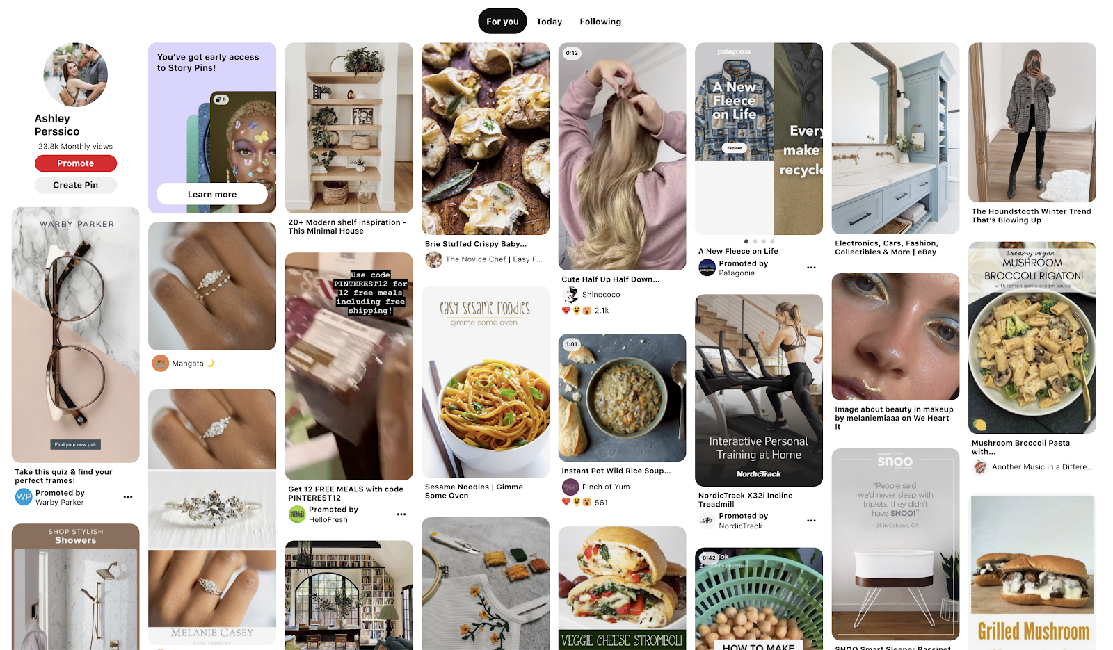
Pinterest popularised the masonry layout.
On small screens where the latest blog is the same width as the other blogs (as there's only one column), I increased the font size and added a visual cue between them to provide clear distinction - a simple grey line similar to that above the footer.
For the bottom 'row' of cards, I put them in the shortest columns first to try and even them out a little more. It was a bit of a struggle finding the best design that ordered the cards in an intuitive pattern, but ultimately it works left to right on each rough 'row', with that small anomaly for the last 'row' for aesthetic reasons.
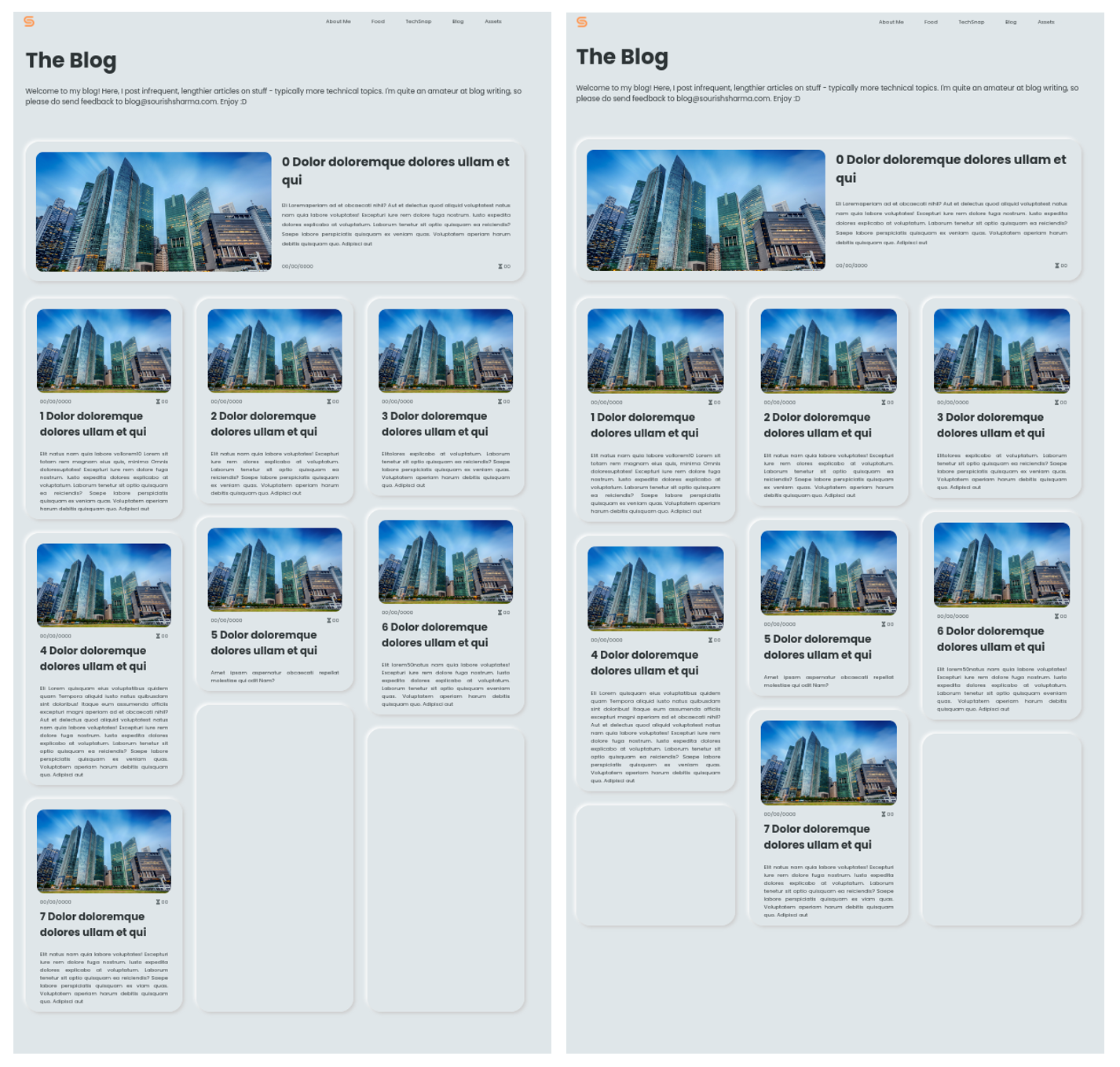
Balancing out column sizes on the right yields a much nicer (and more compact) aesthetic, combined with the blank cards at the bottom. The screen captures above are from development (hence all the filler text - Lorem ipsum is designed to have similar characteristics to English such as word length and repeated pairs but as it's not really English, the text is not distracting and doesn't incite emotions which allows the designer to focus solely on the layout).
Another design issue was how to actually access the blog post. Intuitively, you'd click anywhere in the card, but that meant you couldn't select card text (or I just haven't been able to figure out how to make both work...), which some people may want to do. So I thought clicking the image was the next best thing, and I could add a nice opacity/shadow effect on hover to make it more obvious.
Finally, the initial animation is a simple fade in for all the cards, with the latest blog fading in much quicker than the rest to again draw emphasis to it and make a sort of gentle waterfall fade effect. The animation is minimalist as the user is typically there to find a blog and nothing else. Now, on to the blog posts themselves!
Blog Post
A good design here is fundamental. You need to keep the user engrossed in the content, and not get distracted or frustrated with design elements. First off, and I thought this was quite interesting when I began to code the site, lines of text have to be short.
You may have noticed on certain sites (random physics explanation sites come into mind here), the lines of text span across the entire screen and it's very ugly and hard to read - you have to move your eyes or if you have a large monitor like me, your entire head just to read one line. Then, when you move your eyes (or head) back to the left of the monitor, you have to find which line you're on now. It's hard to keep track of the lines when they are so long. Therefore, you may have also noticed that articles or blogs have very short line lengths. And whilst it may initially seem weird, reading such text is so much easier and significantly more pleasant. Also, there is less structured white space which isn't aesthetic. Anyway, the idea is that humans like short lines when they read stuff on a screen, hence character-limiting it is vital.
So this is what I also had to do. I centred the article in the screen to make it symmetrical (I don't like when it isn't centred - think BBC News articles). But then, a bigger issue on larger monitors, there is so much empty white space and it feels a little boring and lonely, like the content is just sitting somewhere in a void. Yes, there was too much spacing!
To fix this, I used the most valuable asset any web designer has in 2022 - blobs. No- not just normal blobs, but linear gradient blobs! If you look for them, you'd notice this type of thing all over the web to make sites feel modern and elegant. So after creating some pretty blobs using this really cool tool, I implemented them in the code. They're in the background of the blog posts, and there's a bit of transparency to the post so blobs can be seen through the text (otherwise they seem to just disappear if half-covered by the post) - look carefully now and you'll probably see some.
It helps break up the boring regularity, and adds a splash of fun colour without distracting the user (as I made them less vibrant). To get the linear gradients right, I set bounds. You wouldn't want a blob turning from a deep red all the way to a deep green, so I made the colour changes smaller and subtler, generating the second colour by rotating the first hue a little in the HSL colour space - a really powerful colour representation technique for automation. This also ensured that the Saturation and Lightness remained constant in the blob, resulting in a nice blob.
Now, the thing I absolutely hate most about most blogs, and despise from the bottom of my heart, is all the gunk around the actual blog post. Almost every blog, especially if it's on a more major site, has loads of ads, external links, ugly navbars, socials and internal links. Agh. I hate it so much. I just want to read the content in peace and with ease! Please!
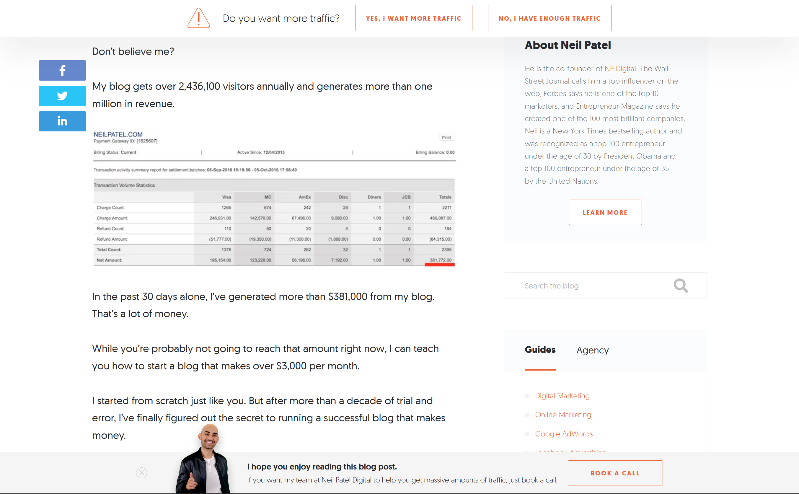
A blog from Neil Patel's website - so much clutter! His content is very good though, and I would recommend reading it/watching his YouTube.
This is the reason that "reader view" (and extensions alike) exists on browsers! To get rid of all of that, and only provide the content that the user actually wants. It's not perfect though, and it removes much of the styling (and sometimes even real content). I always ensure that reader view works well on all my blogs, but even if it doesn't, my blogs are typically styled very cleanly and are easy to read anyway. There is the navbar, then the post, then the footer. Nothing else. It's that simple.
So none of that junk on my blogs! Also, most blogs/articles have a scroll indicator to show the user how far down through the article they are - these are typically a horizontal line at the top of the screen. It's kinda cool, but a complete waste of space and too distracting. The user can just glance at the scrollbar if they really want to know how far through they are - and because my blogs don't have extra stuff at the bottom like comments, big footers, and more links, the scrollbar is quite an accurate representation of how much the user has read. Therefore, I happily excluded the scroll indicator.
For the to-top aeroplane feature, I used an icon for simplicity, opting not for an arrow but a plane to add uniqueness and inject some fun curiosity in the user. And at least a plane makes sense... because it flies up to the top? And it looks like an arrow anyway. The plane animation had to be fast (unless you want to wait a few seconds just to scroll to the top, at which point you might as well have done it manually), so it couldn't be too elaborate, but a small spring-launch type thing combined with a swervy motion added the engaging flare I was looking for. Again, the physics felt right here and I think that's what made it awesome.
Oh and a subtle touch makes this animation look so much better. I could start scrolling to the top as soon as the user clicks the plane, but instead, I wait for the plane to finish it's spring-launch animation. And only once the plane begins going upwards would the page scroll up - try it. Nice!
Lots of minor things to consider for the blog post as well, such as nailing spacing(!!!), font-sizes, images, captions, bullet points, and more! There are also code blocks, both inline and not. The inline ones should be subtle but clear and symmetrical, whilst the large blocks should have syntax highlighting, a soft colour scheme (I chose Tomorrow Night; soft, dark, and popular), rounded corners, and a copy button - all things that I desire myself in code snippets.
A feature added whilst writing this blog (once I began to realise how darn long it is) is the copy-link-to-subheading thing. I had to ensure the chain icon was clearly there, but also not distracting from the even aesthetic. The toast at the bottom of the screen is either green (if successful), or red (if it failed) for a simple confirmation system. It comes in with a nice animation, and swiftly goes once the user scrolls - and therefore ensures they have seen it/wants it to go away so they can continue reading in peace/will close the tab anyway so setting a time out is worthless. The URL system here is also pretty obvious, so if I ever change it, at least the reader will be able to easily tell what subheading they got up to based off the URL they saved. They may also be saving a section as it has information which they would want to refer back to in the future. Either way, I quite like this new feature, and think it's really neat (not biased!).
Finally, the intro animation is a small up-scrolling one. It acts as a cue for the user to begin engaging, and scroll down to read more. I just saw it somewhere and thought it would elevate the experience on my own site.
TechSnap
This one was tough to design. Since the concept of TechSnap was quite unique in the first place, I wanted a unique design to go with it. I also wanted the page to feel a little faster, snappier like the Snap in TechSnap. In the end, it was all about interactivity.
I had to abstract what I wanted down to a few core ideas. I was going to have mini articles with an image or two each, and wanted to do a couple a day or so. The idea was that the user can find the latest news here, so I went for a time-centric approach and organised all the stories by date.
I was considering showing a preview of every story at once, but this would be a little messy and hard to execute well, so I sided with a carousel of stories for each day. This maintained a good level of organisation and clarity. Each day was a card, and I also removed all animations from the page for a snappier feel - except the arrows appearing upon hovering on a card, as these cue the user to interact with them so draw emphasis through added variety. There perhaps wasn't a whole lot of logic into the design of this page (so I can't talk about it much), more just letting my creativity go wild!
However, it was the very last page I designed and coded, so I could bring in my knowledge and experience from all the other areas to create a really solid outcome.
The small menu bar at the bottom of each story would be faint unless you hover on it, to keep the user engaged in the real content. The tooltips when hovering over the icons on the bar also kept the interface simple and relatively intuitive - the idea of this page is to let the user explore themselves about how it works, aided by lots of visual cues and design consistency with things such as blue on hover and pointer cursors. As people who visit this page would visit it frequently, once they understand how to use it, it would be very easy for them in the future.
The full screen mode has a white blurred background, which I thought looked very elegantly modern and again kept the user focused on one thing. You may have noticed by now that a lot of web design is about creating an intuitive experience for the user, and adding lots of cues and ways for the user to not feel lost whilst also letting them explore a beautiful website that feels intentional but unique.
For mobile, I couldn't add any sort of hover cues but the entire interface hinged on hover. This was a bit of a problem! Instead, I 'activated' a card when it was roughly central in the screen of the phone - whichever card was most on-screen would be activated, which essentially turned on everything that would otherwise appear on hover. I had lots of issues with the arrows being tiny targets on a phone, so I would keep mis-tapping them! To resolve this, I just made the cards wider and increased the touch point area for the arrows. This is why proper beta testing is so crucial; I prevented mounds of user frustration, and a frustrated user is never coming back again...
The bottom menu bar on the stories also had to always be activated, so I dialled down the opacity to help it blend more in the story whilst still keeping it clear - as well as increasing the touch area again. I also had to remove the time icon as the user couldn't hover to check the time so I decided that letting them just read the time on the story title page was enough.
Finally, the initial animation causes rows of cards to appear as you scroll, with a sort of sharp bouncing-into-place effect to convey the high energy, interactivity, and snappiness which I desired. This energy is also carried through the 3D card-flip animation when the user opens/closes a story. I thought this animation was very cool! It's hard to pin down what exactly it is because it's so fast, but it feels awesome - physics is king.
Oh, and maybe you noticed the Easter egg...
Food
This is my favourite part of the site; it's mouth-watering eye-candy. The design had to complement the photos to make it look visually incredible; as if you could just reach into the screen and grab some chocolate cake or rosewater ice-cream. The solution? Simplicity. Emphasise the photos.
I had to show all the photos compactly (not one per line, or else we'd be here all day), and so opted for a relatively standard row-oriented layout with a few images spanning each row. This feels like the blog layout, but rotated 90 degrees, and maintaining an even gap here as well between each element results in a very satisfying grid. The animations for the images to come in are a highlight here. Once the photo's position starts to enter the frame (or is already in it when you first visit the page), each image in the row fades in and moves up, from left to right.
This animation isn't visually complex, but I thought it was a very nice idea to enhance the UX and make it feel elegant or magical, as (just like TechSnap) it also responds to the user's actions.
But, I needed a way to show the names of the dishes in case it wasn't obvious or the user didn't know. So a hover effect was good here to keep the interface clean whilst providing the necessary information. To make the white text stand out and be clearly legible, it needed a contrasting dark background which I achieved through a shadow gradient thing. This still ensures the image is clear, but draws emphasis and clarifies the name of the dish. In fact, this is the only place on the website where I have pure white text, just to help that contrast pop!
Full screen mode makes the image large - but not too large or else it's a bit ugly and the uneven spacing is obvious. The upper-right cross animates in delayed to not overwhelm the user, and to keep their eyes on the image. I made the background of full screen mode a translucent white - it was initially a translucent white blur (like the TechSnap full screen), but the blur of the background with the bokeh of some of the images hurt my eyes and confused me! So a simple flat background was perfect here.
Of course, not everyone wants to have to click the cross to exit full screen (as it's inefficient to move your mouse all the way there... or is that just me?) so the user can also intuitively click outside the image to minimise it.
An issue with entering full screen is that a new, higher quality image is loaded in and therefore another network request is made. But since the image file is generally quite large, you can see it be loaded in sharply which works against the smooth fade animation I intended for. I might try and add preventative measures to this, such as sending the network request for the high quality image once the user hovers on the preview or scrolls to it on screen, meaning the high quality image is ready to be displayed before the user even clicks to full screen.
But in theory, there is a really nice fade effect upon maximising/minimising an image. Also, just like with the TechSnap story full-screen mode, I treat it as a modal, so the user can't scroll or interact with the rest of the webpage until they close the modal. I find that this is just expected behaviour from websites now!
404 Page
Ahhh this was a fun one. I perhaps didn't follow the standard conventions for a 404 page with a clear error message and points of action... but oh well - my audience would probably be technical enough to know what a massive 404 means!
Since this was an error page, I thought that making the text glitchy would be apt, so I threw together a classic glitch animation for the 404 text. Then a simple error message and a button directing them back to home in case they're utterly lost. Oh, and of course I had to include the dark mode toggle here too!
The result was simple and clear, whilst also having a fun touch. If you're one of my OG site users, you may have noticed that the assets page points to the 404 page - this was intentional, I admit! The assets page isn't essential yet, and I haven't started coded it (as of writing). So what better way to show off my error page than inviting people to see it through the Assets navbar link?
Progressive Enhancements
Remember this from last time? UX is very important here, because it's all the subtle things combined that makes the experience, so anything you can do as a designer to improve the experience is worth doing, no matter how small.
I tried to maintain this philosophy in my own website (within reason - I am a one-man team after all!), and pay attention to all the details, sometimes spending hours on a seemingly trivial task. But nothing is really trivial. Every corner, every shadow, every hex code, every pixel matters.
Of course, the experience can vary from user to user; browser to browser; device to device; iPhone to iPhone, but the goal is to make it very good for as many people as possible in as many scenarios as possible. That's a lot.
The scroll bar was first. I really hate the default scroll bars in most browsers and operating systems. They're fat, ugly, and don't fit in with the site aesthetic. So I made one that does fit the site aesthetic. It's rounded and blue, and seems to be a natural extension of the site, as opposed to a feature stuck on afterwards. It may not be as accessible, and may not have all the features of a normal scrollbar, but it sure looks galaxies better. And in reality, a tiny proportion of my users will even care about the issues created (not valid reasoning in a commercial website though - inclusive design!).
Next, the text highlight colour. My oh my is this also ugly by default. The harsh weird blue highlight just didn't fit in with the colour scheme and soft UI. Thankfully, all I had to do was choose a pastel yellow and done. It can still look a little harsh on dark mode, but all the subtle colour discrepancies on dark mode are easy fixes (when I bother to fix them, that is).
The highlight colour goes from an eye-sore to eye-candy. As trivial as it may seem, it makes a massive difference.
Now, those were the two major ones I wanted to address, but there were still a load of other small things such as touch actions and animations.
And some stuff about buttons. So the idea of neumorphism is all to do with 3D, and that means that, when you hover over a button (such as the dark mode toggle), the icon/text inside it should get smaller as the button depresses into the screen. That's how real life works - something further away is smaller, so text on a pushed button looks smaller than text on an un-pushed button.
It may not seem like a big deal, but it makes a significant improvement to the user experience. It's not something you'd think about, but it is something you'd subconsciously notice. It turns an otherwise nice computer transition to a real physical emulation - physics makes everything better. Right now, I've only implemented this on the dark mode toggle button (try it), but other buttons across the site such as in the navbar or in the 404 Error page would really benefit from it. It's surprisingly difficult to code in though (at least, if you want to do it right)!
JavaScript Disabled
JavaScript - perhaps the most used language on the web. And yet, JavaScript may be disabled (for security purposes) or not work in many cases, but as so many parts of the site rely on it, I essentially don't let the user do anything until they enable JS. So if JS isn't working, they get a very expected warning.
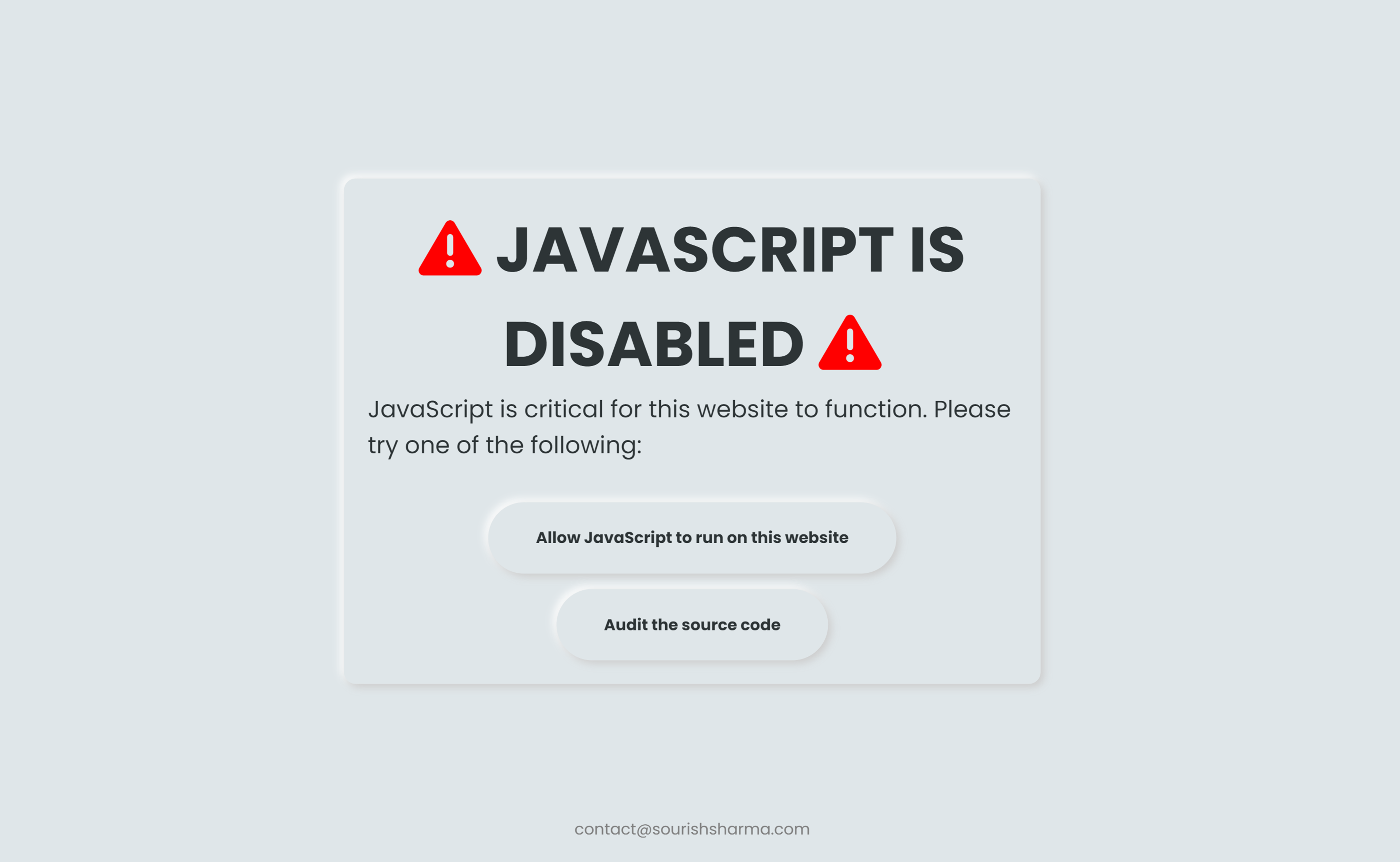
The resulting webpage when a user visits my site with JS disabled. On a side note, the neumorphism style with the light source in the upper left corner is really accentuated here.
Since I suspect essentially no one to disable JS, I haven't got any work arounds for them (unless they re-enable JS). However, there is a possibility that I'll make a no-JS version of the site in the future. Also for this reason, I didn't put a whole lot of effort into the design of the no-JS warning!
I have a very clear message, with an obvious warning for the user in a nice large font and some bright red icons. The purpose of the message is evident, and it means that the user should be able to understand why the site isn't working for them. I also provide a couple of action points to help them, as well as my email address in case they really need to contact me for something. All important things to have on a no-JS warning. And of course, I've maintained the exact same site aesthetic here as well!
Conclusion
That's the design out of the way! The next post in the series will look at some key frontend coding challenges I faced. I hope you liked this mega-post and got a nice insight into the design development of the website, learning plenty along the journey. Design is perhaps the hardest aspect of creating a website, especially if you are technically-minded and aim to be a developer, but I think spending some time looking at it can result in really stunning websites and give you, a developer, valuable skills. It means you can make all sorts of design decisions yourself when coding a website, instead of having to contact (and pay) the designer again, wasting time.
The key takeaways from web design are to focus on an intuitive layout, not overwhelming the user, and keeping a consistent aesthetic across the site. Why? Because they all have a common goal - to create the perfect user experience. Now pop off and grab that sketchpad!
copied!
failed to copy!